Background
I’ve been hard at work on new recipes, and I’ve created quite a few, but I simply haven’t been good at publishing them. Oh well. Better late than never.
I’ve replaced the original set of recipes in my Q menu. I did this partly because my original recipes had some issues, for lack of a better word, that made them not work as well as I hoped. One of those is that I used a variety of white balance settings rather than use AWB. This looked great in the pictures I used to create the recipes, but it simply didn’t work in other lighting conditions. I found this especially true indoors when I frequently deal with truly atrocious soft “white” lights. That dull yellow hue is ugly enough, but when coupled with a color temperature white balance is just plain disgusting. With a single exception, my current generation of recipes uses AWB, making them much more versatile. The lone exception is not likely to be used indoors, and at any rate, it is B&W, so that would be less of an issue anyway.
Several of my original recipes were also somewhat gimmicky. That’s fine, but since I use raw+jpeg, I can always drop the raw and X Raw Studio and redevelop it if I determine that one of the older recipes would work for that particular shot.
Finally, since I was inexperienced, I wound up doing things that looked somewhat boring. This was most apparent in Bold Color, which had highlights toned down, and therefore clouds looked dull. I’m no longer “scared” of boosting highlights. I’m also coming around on doing minor post-processing to correct lighting issues; the camera only lets me do so much internally, and I typically shoot in harsh lighting. Two of my new recipes are designed to deal with that.
The recipe
Real Color replaces both Hi Color and Soft Color. The former never really found the utility I was hoping and the latter, since it was my go-to, really started to show the deficiencies listed above. It satisfies my desire to have a general-purpose saturated but not overly so recipe. That name derives from the fact that I created it to produce realistic colors. It is one of my go-to color recipes and is meant to complement Truchrome (not published as of this writing), a similar recipe but de-saturated.
Real Color is, like Hi Color, based on the “Pro Neg Hi” film sim.


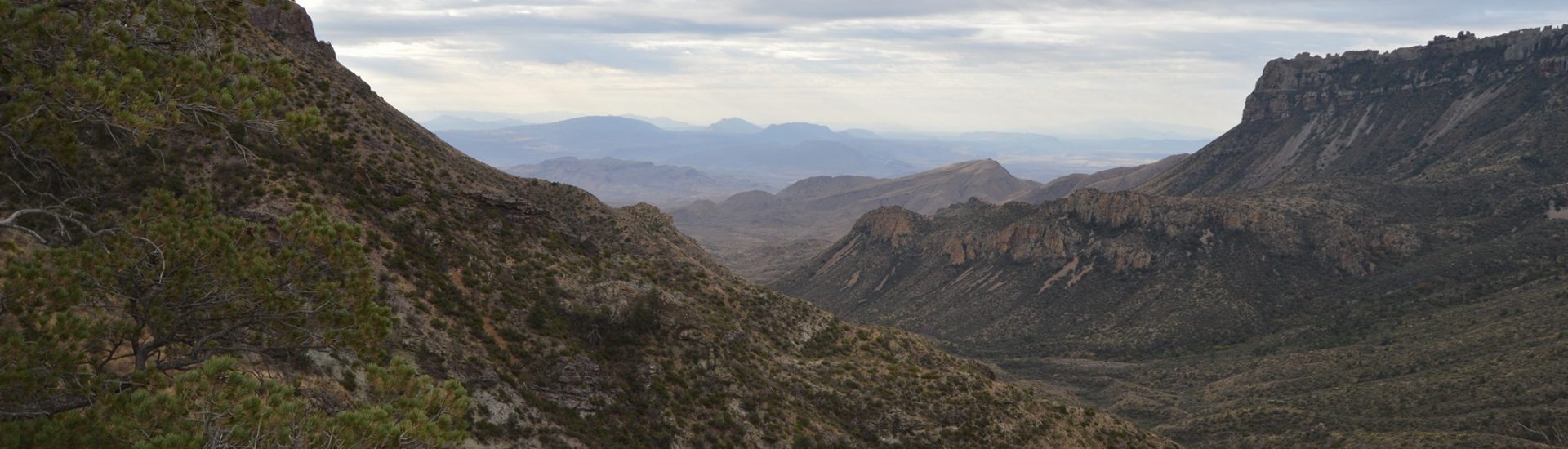
Some samples of Real Color where I was able to add contrast.


Here are the standard settings:
Real Color


Film Simulation: ProNegHi
White Balance: Auto R: 0 B: +2

Dynamic Range: 400
Highlights: 0
Shadows: -1
Color: +4
Sharpness: +2
Noise reduction: -3
Grain Effect: Weak
CC Effect: Weak
ISO: Auto
Exp. Compensation: 0
This recipe is licensed: Attribution-NonCommercial 4.0 International (CC BY-NC 4.0)